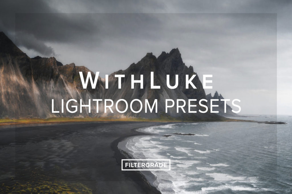
A Guide to Editing Dramatic Landscapes in Lightroom with Luke Stackpoole

Hey everyone! I’m Luke Stackpoole, a landscape and lifestyle photographer based out of London. Over the last year I’ve travelled to some pretty beautiful destinations and I’ve created a series of presets that help to capture the essence of the environments that I ventured to. Throughout this guide to editing dramatic landscapes in Lightroom I’m going to walk you through the steps I take to bring a base raw image into the style of imagery you will see on my Instagram feed.
I’ll be using my FilterGrade presets to help walk you through my editing process and I hope that this tutorial can help you achieve a dramatic look to your images, and if you have any questions don’t hesitate to drop me a message!
Getting Started
So, jumping right into it, here’s the raw image I’m going to be working on – a scene from a morning drive through the Californian redwoods, and here is the shot after I’ve edited with the help of my presets. Quite a distinct difference in mood, and all this is achievable with 10 minutes in Lightroom!
Before After


1. Apply Preset

First up, I’m going to cycle through my presets until I see one which fits the scene, in this case, my preset “Earthy Greens” worked best due to the muted green tones. Applying this allows me to work from a base layer to help keep things consistent throughout my workflow and to also speed up some of the tasks such as setting a tone curve. I also make a note to fix the exposure at this stage to match the atmosphere I want to create, which is a slightly darker, morning glow.
Notice now that the colours and light have shifted dramatically. This is due to the preset applying some contrast, colour adjustments and tonal curve changes and to mute those vibrant greens to be a more pleasant aesthetic.
2. Clean Up Your Image
Now before I do anything else to the photo I typically always look to remove distracting elements as this allows me to focus my attention on the photo and not any nagging flecks of dirt in the foreground, or in the case of some photos people / cars / other objects! Select the heal / spot removal tool in Lightroom and apply as necessary

3. How to Utilize the Basic Tool Panel (preset does most of the work)
Running through the panel below, we can see that the preset has applied some significant contrast to the image, balanced out by some raised blacks. This method allows me to keep an image punchy and vibrant but at the same time have a little fade to it to keep the dreamy look. The lowered highlights (yes -100!) are there to soften the image to the eyes and to stop those harsh whites you see in the raw file. You can experiment with this yourselves to taste.

Another important tool in this panel is the clarity slider – this is a key step to creating a slightly magical feel to the image, as again, it softens those harsh edges to make it look more like a painting than a super cluttered image. I set this to between 0 and -20 depending on an image.
Following this, I also like to add +10 or +15 vibrance just to balance the fact that I’ll be bringing down the saturation of a lot of my tones in the HSL panel, helping to keep the image vibrant.
4. Tone Curve Fade
In addition to the adjustments above, the preset applies my standard tone curve to the image. This dampens the blacks and whites, creating a more matte look. You may be familiar with the S curve and I use a variant on this for most of my edits. For portrait work I like to indulge in the RGB curves but for landscape I don’t typically use this.

As you can see, no huge adjustments but it definitely keeps my style consistent between images, even with different light and colours in the scene!
5. Color and Split Toning, Finding the Right Balance.

Probably the most important stage of the edit process and the most time consuming. Getting colours to work is all about working with complimentary colours, and in the case of this image, I’m going with dark orange / muted green. There is a fair amount of blue in the raw image, and that is why in most of my presets, including “Earthy greens” tend to desaturate these tones as it’s good to keep one or two primary colours dominant. You should make sure to think about what colours are too dominant in an image and either work off those or eliminate them!
Having applied the preset, the image is in a good shape, however I will tweak these ever so slightly to bring the yellows more to the muted orange and pull the greens back even further. I will then add a warm highlight to the split tone in order to create a warm glow.
Here’s a before and after the changes:


6. Detail Tab (important!)
In order to retain the crispness of an image, despite the reduced clarity from the basic panel adjustment, I tend to add an increased amount of sharpness, which is applied on all my presets.
The secret to doing this without introducing noise is to hold alt / cmd key and drag the masking slider to see where the sharpening is being applied to. I typically hover around 50-70 which is usually the edges only. Now the image will be looking dreamy and soft as well as punchy and crisp on the edges!

7. Creating Ambiance and Light
This last editing step is often very simple but the most striking. First of all, I like to apply a basic vignette to most of my images as this leads the eye of the viewer to the subject. -10 can do in most cases, ensuring to set the midpoint and feather appropriately.
After this, is where the magic happens. Using a mix of radial filters and graduated filters, I darken the road and sky to essentially create a more localised vignette. On this image I’ve used around 5 of each as you can see below for graduated:

8. Final Export Settings
I’m not sure how important this trick is to my workflow but I get asked often enough – this is the settings I use to export all of my photos:

Finished!
And there we have it! A moody morning in California. I hope this tutorial was helpful and gave you a little insight in to what you can achieve with your own images!


